Inspired Color
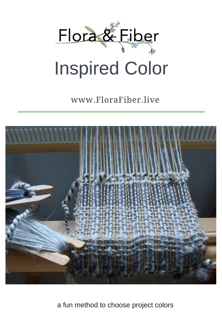
Glancing at this post's cover photo, you're probably thinking Inspired Color? But, what I'm referring to is finding inspiration for choosing the palette for a project; whether those colors be brights or pastels or, as in this case, neutrals. Oftentimes, I find a new project is stalled by the process of color decisions. I'm sure you can relate, whether your creative medium is weaving or knitting or pottery or scrapbooking or home decorating or [insert your own]. There are so many color choices, where to start?
I find color fascinating. How do we individually perceive color? How does color affect mood? How do colors interact with each other? How do we use color in design? On and on and on. But for this post, I want to focus on just a small aspect, how to find inspiration for selecting a project color palette. To narrow that concept even further; how to use a picture as inspiration.
There are a number of ways to do this. I am in no way an expert, but rather, I'm sharing some discoveries I've gleaned from my internet traveling. Here are just a few:
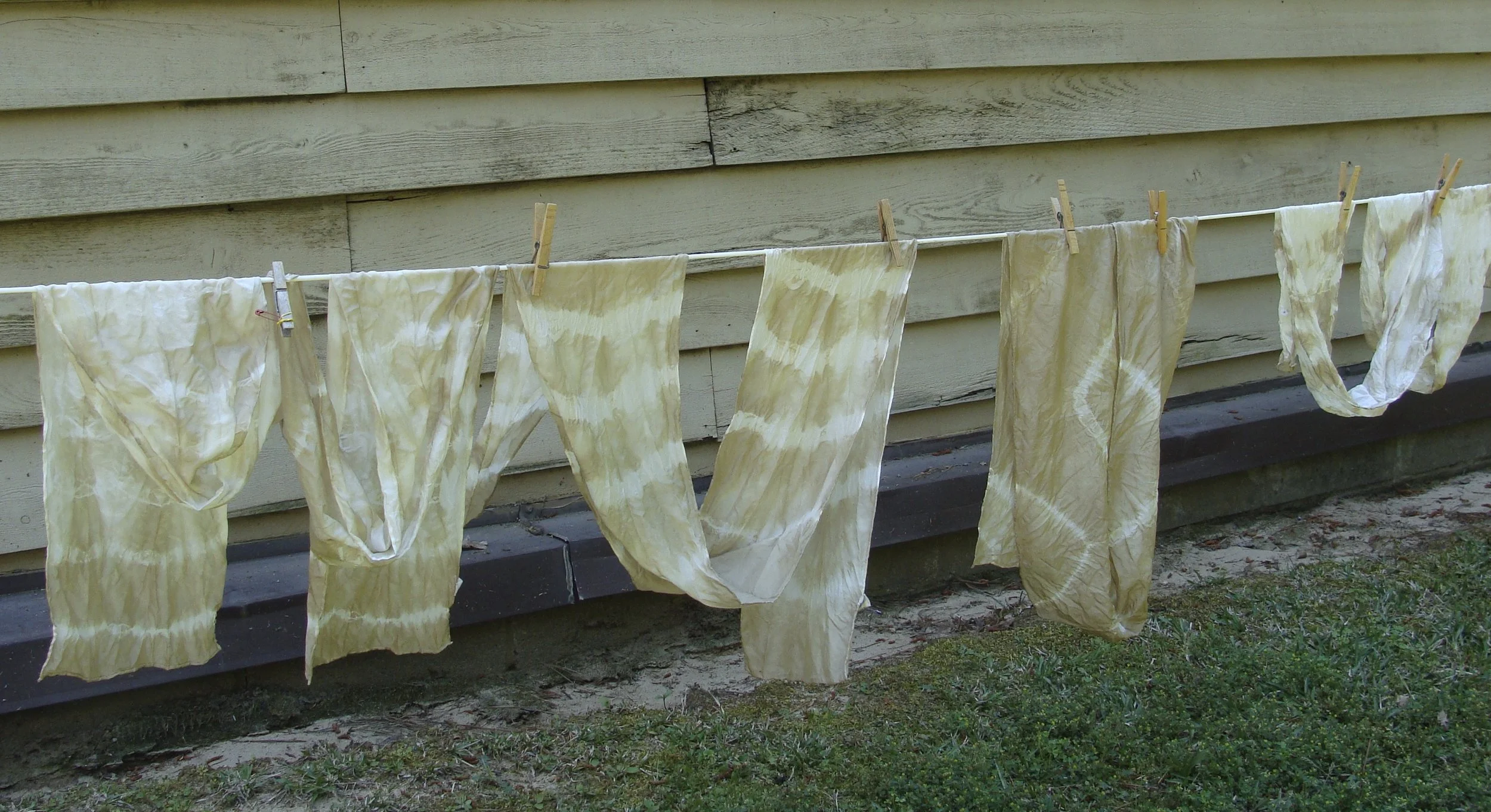
DeGraeve.com. This website provides an immediate color palette simply by pasting in any online image's URL and clicking the 'color-palette-ify' button. Here's one I did from a photo from this blog post on Shibori dyeing and weaving. As you can see, two palettes are generated, one dull and one vibrant.
TinEye Labs - Upload a photo to this site and the Multicolor Engine will display a palette not only for all the colors identified in your image, but in the proportions they are found. The color extraction tool works for JPEGs, PNGs, and GIFs. Here's one from a photo taken at the farm. I liked the palette so much that it inspired the colors for my branding of Flora & Fiber.
Picmonkey - On Picmonkey, upload a photo to their site and then pick colors by placing your cursor over various points on the photo to create a palette for your design project. I don't have experience with Picmonkey, however I have included it because it is a popular site that can do so much more including photo editing and design work.
Design Seeds is a color inspiration site which posts palettes that have already been put together. Jessica Colaluca, the founder of Design Seeds, creates all the palettes. She has a creative community of followers that contribute their inspiration photos from around the world via #SeedsColor.
So that leads into the method I used for this particular project. Several months ago, I took an online course taught by Jessica of Design Seeds. This is an excellent class on Skillshare (see below for more information about Skillshare) called 'Inspired Color: How to Successfully Use Color in Your Work'. The project assignment was to apply one of four designated Design Seeds palettes to an original piece in your creative medium "whether it's an illustration, a dessert, or a hand-knitted scarf".
I chose this Winter Palette. Living on a small farm, the rustic inspiration photo and colors just fit. Since I am a weaver and spinner, I wanted to create a fiber arts project. I could have hand-dyed my fibers, but I wanted to challenge myself to put together a palette from what I already had in my stash. Here it is:
The colors in real life are truer to the winter inspiration seed palette.
From left to right:
- Venice Snow (Skeino) 50% baby alpaca, 22% nylon, 7% merino, 21% polyester (glitter)
- Wisp (LB Collection) 70% kid mohair, 30% silk
- Wild Rye (Imperial Yarn) 100% wool
- Handspun (by me) 100% wool
- Charcoal Grey (Interlacements) 50% silk, 50% soysilk
- Gray Pearl (Lion Brand) 65% acrylic, 35% wool
Finding a project to suit this particular set of fibers was interesting because their fiber content, grist, and texture were all quite different. I settled on a scarf adapted from the 'Flower Power' scarf in Woven Scarves by Jane Patrick & Stephanie Flynn Sokolov.
One of the first tasks was how to use the mohair and silk yarn. As its name implies, it is quite wispy, even for the weft. I decided to "ply" it with the Grey Pearl acrylic/wool yarn by way of a run through the spinning wheel. Definitely unique! I love the soft halo it gives to the finished scarf.
I wanted to include some of my handspun yarn and chose one of the first yarns I spun. For those of you who spin, you remember those early yarns as unintentionally thick and thin. However, that's just what I needed for my chosen design - a weft yarn with thick areas to be lifted to the surface during weaving to create random "flowers".
These thick yarn 'lumps' were pulled up between two warp threads and then held in place by the silk/soy silk weft. The above photo actually shows the scarf before it was wet finished. I hand washed in very warm water with gentle agitation and then laid it flat to dry. The fibers fulled and closed a little after this process, locking the "flowers" into place.
Here are some pictures of the finished scarf. It turned out lightweight and wonderfully soft; perfect for winter in coziness and palette!
**For those of you unfamiliar with Skillshare, it is an online learning community that offers over 17,000 classes in a wide variety of topics. I have taken many classes and even taught a class on Natural Dyeing. As a teacher, I can offer you 2 free months of Premium access to all classes on the Skillshare site by using my referral link. In full disclosure I do receive a small payment for anyone who uses my link.**
