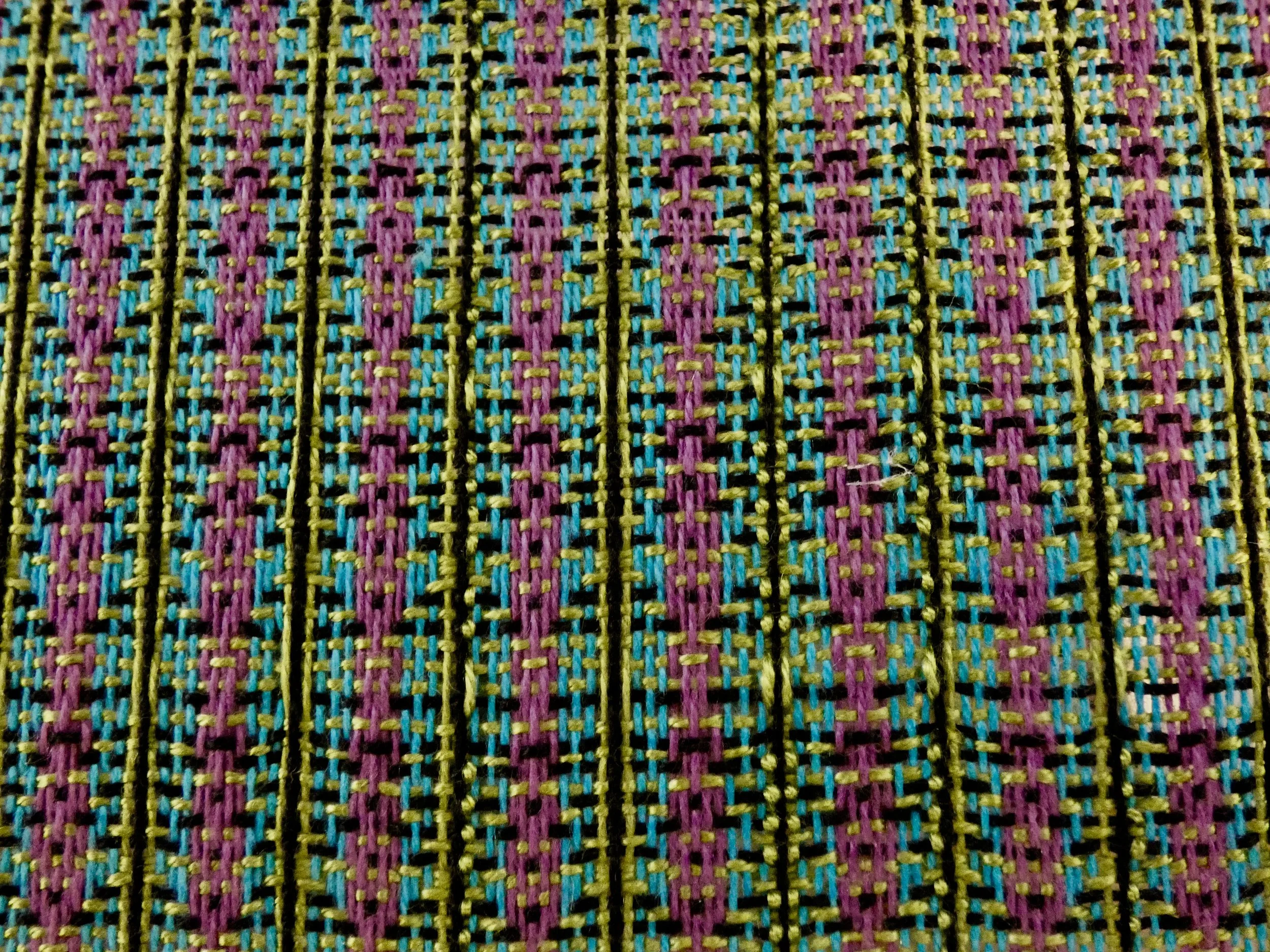
Choosing Colors - My Pearls
There have been many articles written that highlight various perspectives and approaches to color selection. Understandably, there is always some overlap of content. However, no matter how many articles I read or videos I watch, I always seem to glean new pearls of wisdom, whether from a weaver, a spinner, a knitter, a dyer, or sometimes from a source not associated with the fiber arts at all.
At last month’s Guild meeting I presented a workshop on choosing colors and some of the resources that I have found valuable. It was well received so I thought I’d offer the information here.
ONLINE TOOLS
First, I’ll talk about online tools. An internet search will uncover a gazillion wonderful color-related tools. The following are just a sampling that I find easiest to use and with the best application for my fiber arts purposes . . . and they’re free! I am not affliated with any of these sites, I just like and use them.
I’ve created a PDF that includes this information with links in one dandy handout. PDF Handout.
COLOR INSPIRATION
Design Seeds
This is one of my favorite color inspiration sites. The color palettes are inspired by beautiful photos, quite often from nature. There are a number of ways to use this site. First, there is a new color palette released daily. You can also search by season (ex. autumn), by color (ex. citrus), or by collection (ex. Sweet Tooth). It’s truly eye candy and very addicting!
This tool generates a 5-colors palette. You can select the colors you want to keep and repeat the process until you have the combination that matches what you want. You can start with your own colors or a photo, but the beauty of this site is that it generates palettes without you even needing to have a color in mind.
Here I’ve chosen to keep the last three colors, but generate a new combination by replacing just the first two colors.
Another cool feature is that on each individual color you can see 20 shades of that hue.
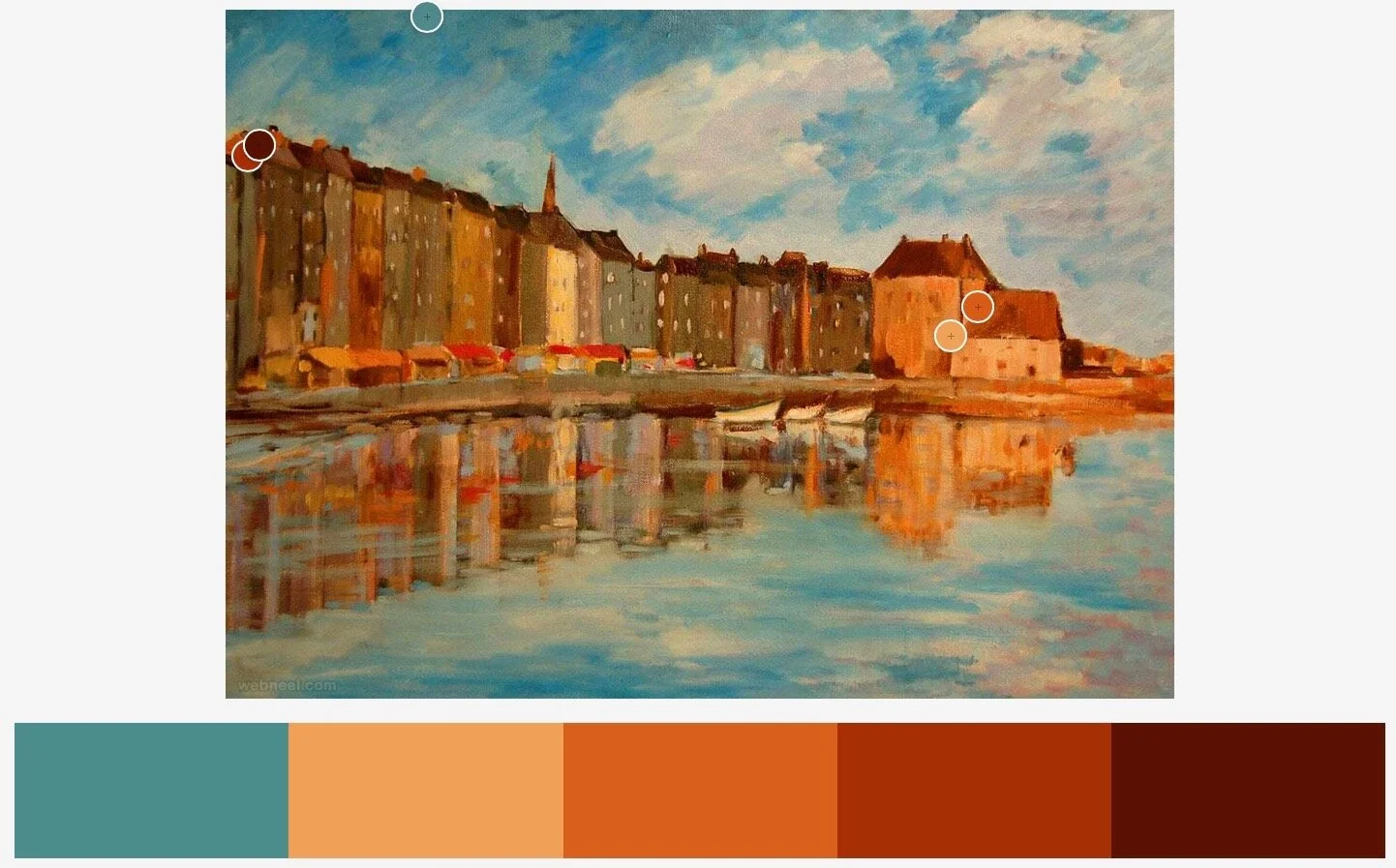
For the remaining color tool demonstrations I am using this beautiful Claude Monet painting as inspiration.
Adobe Color
Adobe Color creates a color palette by choosing a base color and applying Color Rules (ex. monochromatic, analogous, etc.) or by extracting a color palette from a photo like I did above. Easy to use.
Here is an example of the tool applying the principle of complementary colors.
Another example, this time using shades and a monochromatic color scheme.
Adobe Color also has the option to change the Mood of the palette, here it’s bright.
And here it is a muted color palette.
Tin Eye Lab
The Multicolor Engine couldn’t be simpler. Upload a photo or enter an image URL and hit ‘extract colors’. A color palette is generated and best of all the colors are given in percentage from the photo.
Halcyon Yarn Color Picker
This site is not as dynamic or easy to use, but it does have the feature ‘Get Matches’ that makes actual yarn recommendations to match your color selections.
SPECIAL COLOR TOOLS
Now that you’ve generated a spectacular palette, here are some tools to aid in the design of a project that will complement your color choices.
Color Blend Tool Margaret Coe e-Weave Online
This is a great tool if you want to do a gradient project. Pick 2 colors and then the number of gradations you want (from 1-10) and the tool blends those colors and gives you a gradient.
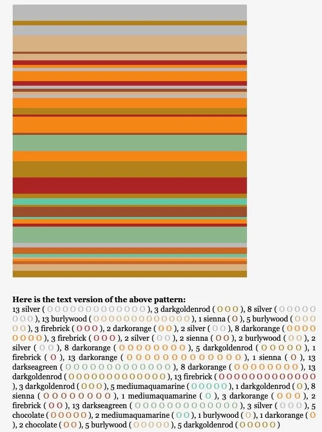
Random Stripe Generator Biscuits & Jam
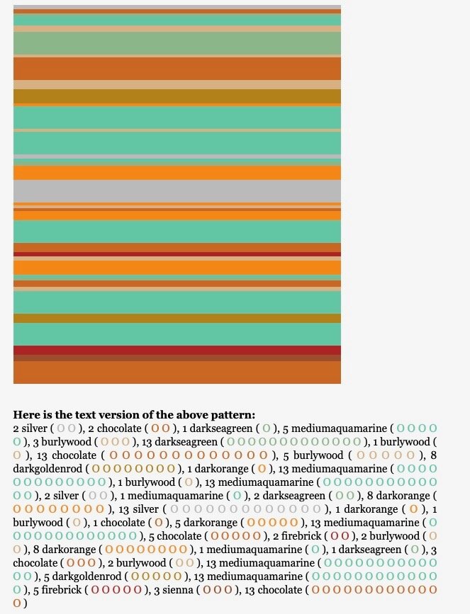
This is a nifty little tool that generates stripe patterns You enter your colors (choose from palette on site), desired stripe widths (choose as many as your want), and approximately how many rows. Voila a stripe pattern. If you don’t like that pattern, refresh the page and you’ll get the same information you entered only in a different patten of striping. In addition, you get a text version of your pattern.
Here are two additional stripe patterns I generated all from the same choices of color, stripe widths, and number of rows.
Tartan Maker
There are a number of tartan/plaid makers online, but I found this one to be the easiest to use. You can use up to 3 colors and can vary the width of your bands.
I decided I wanted more aqua so I adjusted that band slightly up and decreased the bands of the other two colors.
Here is a full screen view of the ‘Monet’ tartan.
Weaving Color Mixer Tien Chu - Warp and Weave
This is a fabulous color mixer to visualize warp & weft color choices in 4 different weave structures: plain weave, 1/3 twill, 2/2 twill, and 3/1 twill. You can choose the color for the warp and weft either by picking the color from a color grid/display or by uploading a photo. There is also a feature to look at color blends ie., 75% warp/25% weft color blend. And for the geeky (me!) it gives the colors in Hex code, RGB, and HSV.
You can also adjust the size of your pattern to see how the colors interplay at different scales.
SELECTING YARN FROM A COLOR WHEEL
There are a plethora of articles, videos, and guides on how to select yarn using a color wheel. Quite often this is done using the principles of color theory; analogous, complementary, monochromatic, etc. But I learned a valuable lesson from Sally Melville, the well known knitting teacher, author, and pattern designer.
I’ll share the essence of what I learned from her wisdom.
All colors in a color wheel go together. What doesn't go together is the different intensities of those colors. ——— Sally Melville
Different intensities on the color wheel are shown in concentric circles, each of those are called tonal ranges.
The outside ring is where the colors are presented in their most vivid arrangement, the purest hues.
Next, if white is added they are called tints or pastels.
If we add gray, these are called tones or dusties.
And finally when black is added, these are shades or dark colors, often also called jewel tones.
So if you stay within a tonal ring of the color wheel, all the colors will go together.
PRACTICAL EXAMPLE - Choosing Colors for Stranded Colorwork
So we have our inspiration photo and our color palette is generated, now what? We go to our yarn stash or a yarn shop and we’re completely overwhelmed facing a wall of possibilities.
I found a wonderful video tutorial by Felicity (Felix) Ford. She has a system for choosing colors for stranded colorwork. Felix created a stranded color work pattern with an adaptable motif (Skystone Armwarmers) which could be knit in different colours to use a wide range of inspiration sources.
Here is a link to her blog post and a link to her YouTube video.
Using Felix’s system, I had my fellow Guild members pull together their yarn choices using a couple inspiration items I gave them. Their instruction was to select five pale shades for the pattern and three darker shades for the background, aiming for a total of eight shades.
Here are the palettes they designed . . . . .
Browns, Blues, Whites
Greens, Greys, Purples
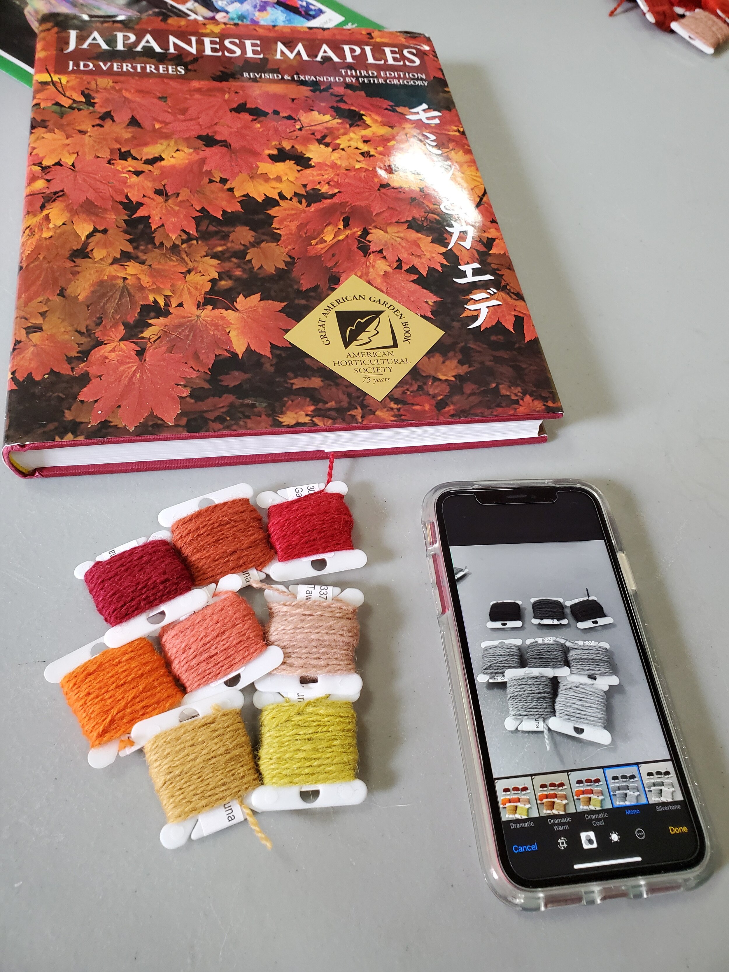
Reds, Oranges, Yellows
A final thought, you'll never use all the colors you find in the inspiration source; it's a juggle of your budget, what’s commercially available (or you can dye), and what's sensible to use in a project.
Thank you to Lisa Murray, Guild member, for taking the last 3 photos.
ADDENDUM (3-21-20)
Stitch Palettes
Stitch Palettes falls under the category of Color Inspiration, but with added bonuses. The palettes are isolated from photos and then matched to DMC embroidery thread colors. There is a new color palette released daily. Like Design Seeds, you can search by color, by season (ex. Spring), by scheme (ex. pastel), or by theme (ex. floral). But lest you think this is only for embroidery, oh no!
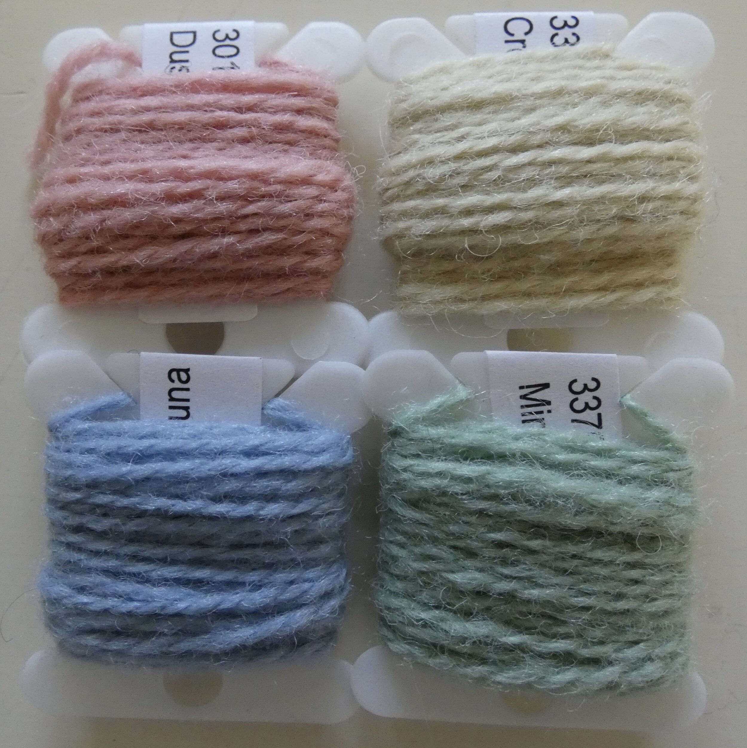
Not only does Krisztina provide the DMC floss matches, but she also converts to DMC Tapestry Wool and Anchor Stranded Cotten.
She also provides the HEX, RGB, and CMYK color codes.
And just in case the palette is not exactly what you had in mind, there are suggestions for similar palettes that share the same colors.
